
Your organization has decided to issue membership cards. Now comes the part that trips most people up: the design. What information goes on the card? What belongs on the front versus the back? What file do you send to a printer? This guide walks through the design and production setup process, from layout planning to print-ready file submission.
The workflow applies to gyms, nonprofits, golf clubs, museums, associations, and other organizations issuing custom printed cards. If you are still deciding what membership cards are, which format fits your program, or which features you need, start with our broader guide to membership cards.
After making those decisions, this guide focuses on designing the card correctly for print and personalization.
Step 1: Confirm the Functional Requirements Before You Design
Before opening any design software or reaching out to a graphic designer, confirm the functional requirements that affect layout. These details determine how much space the card needs for variable fields, scannable elements, and production features.
Questions to answer first:
- Will the card include a barcode, QR code, magnetic stripe, RFID, or no scannable feature at all?
- Does each card need to be personalized with unique member data such as name, ID number, expiration date, and/or photo?
- Does the card need room for a signature panel, slot punch, or other physical feature?
- Will the card be used long term, or is it tied to a shorter membership cycle?
The answers affect layout and file setup. They do not need to be fully explored here, but they should be confirmed before artwork begins to minimize the number of revisions needed and ensure that the cards will function properly for you.
Step 2: Decide What Information Goes on the Card
The most common design mistake is overcrowding. Cards are small. The goal is to include what a member or staff member needs at the point of use, not everything the organization wants to communicate.
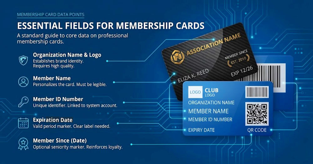
Fields That Appear on Most Membership Cards
- Organization name and logo: the visual anchor. Every card needs this.
- Member name: required for personalized cards. Omit only on non-personalized generic cards.
- Member ID number: a unique identifier that links the card to a record in your system.
- Expiration date: when the card becomes invalid. Place it prominently on the front: visible expiration dates prompt members to renew before the card stops working.
- Member since date: the year the member joined. Optional on basic cards, but valuable on association and club cards. It reinforces seniority and gives long-term members a reason to feel invested in their membership.
Optional Fields by Program Type
|
Field |
Example |
Best for |
|
Membership tier or level |
Gold Member, Lifetime Member, Student |
Any tiered program |
|
Member photo |
Headshot in a fixed zone |
Gyms, museums, ID programs |
|
Barcode or QR code |
Links to the member record or check-in |
Any card scanned at entry |
|
Website or contact line |
Short URL or phone number |
All cards |
What to Leave Off
- Sensitive personal data: no home addresses or anything that creates a risk if the card is lost.
- Lengthy fine print: if a policy runs more than one short line, it belongs in a member agreement, not on the card.
- Information likely to change soon: a rebranding or new website URL makes the current run obsolete. Wait until details are stable or add a QR code with a web link so time sensitive information can be changed as needed online after the cards are printed.
For any program personalizing cards with unique names, IDs, or photos, your design must include clearly defined zones for every variable field before artwork is submitted.
Step 3: Plan Your Layout Before Opening Any Design Tool
A rough sketch of front and back content before opening Illustrator or InDesign saves time. It is much faster to move a sticky note than to rearrange locked layers.
Card Dimensions and Print-safe Zones
Standard membership card format: 3.375 inches wide by 2.125 inches tall (CR80), 30 mil thickness. Same physical size and thickness as a credit card.
Three zones to account for in every design file:
- Bleed: Extend background color or image 0.125 inches beyond all four card edges making the card’s canvas size 3.625 inches wide by 2.375 inches tall including bleed. This is industry standard and prevents white hairlines from appearing if the die-cut shifts slightly during production.
- Safe zone: Keep all critical content at least 0.0625 to 0.125 inches inside the trim line. Logos, names, and ID numbers placed too close to the edge risk being cut off.
- Resolution: Design at 300 DPI at actual print size. Artwork created at 72 DPI and scaled up will print blurry, regardless of how sharp it looks on screen.
Front vs. Back: Assign Content to Each Side
|
Front |
Back |
|
Organization logo |
Barcode or QR code (if required) |
|
Member name and ID number |
Magnetic Stripe or RFID (if required) |
|
Expiration date (optional) |
Website, phone, or short URL |
|
Member since date (optional) |
Signature panel (if required) |
|
Membership tier or level label (optional) |
Short usage instruction (if required) |
|
Member photo (if applicable) |
Legal or policy line (if required) |
The card front contains identity and brand. The back contains functional elements. Barcodes and QR codes belong on the back. Placing them on the front creates visual competition with the logo and can cause scanning problems with some handheld readers.
Step 4: Design the Front
Logo Placement and File Format
The logo dominates the front visually. Top-left and centered are the two most common positions. Top-left leaves more flexible space for member data fields on the right side of the card.
Supply the logo as a vector file: AI, EPS, or PDF. Vector artwork scales to any size without losing sharpness. A raster PNG or JPG is acceptable only if genuinely at 300 DPI at card print size. Low-resolution logos and images are the most common cause of blurry cards with unacceptable quality.
Typography: Size, Weight, and Contrast
- Minimum font size: 8pt for member data fields. 6pt minimum for secondary lines such as a URL or policy note.
- Contrast ratio: Aim for at least 4.5:1 between text and background for small text. Organizations serving older members — associations, museums, golf clubs — benefit from higher contrast ratios. Stronger contrast costs nothing at the design stage.
- Color vision: Do not rely on red vs. green alone to differentiate fields or tier levels. Use position, shape, or a label alongside color.
- Font count: One or two typefaces maximum. More than two creates noise on a card this small.
- Font weight: Avoid ultra-thin or hairline weights on dark backgrounds. Regular or medium weights hold up at card print scale.
Color Mode and Finish
Design in CMYK, not RGB. Screens display RGB, which has a wider color gamut than print. An RGB file converted to CMYK at production will shift in color — sometimes subtly, sometimes noticeably, especially with saturated blues and vivid greens.
- Gloss finish: Enhances color vibrancy. Dark colors appear richer. Gloss is the most popular option and industry standard.
- Matte finish: Reduces glare, giving a more upscale, premium feel. Matte slightly desaturates colors — what looks vivid on screen will appear marginally more muted in hand. If precise brand color matching matters, specify Pantone values and request a physical press proof. There is typically an additional cost for this so only request it if color is critical.
Membership Tier: Visual Differentiation
If membership tiers are desired, they should be visually distinct, not just a text label. Options include a color-coded border or background treatment per tier, a tier badge or icon in a consistent position, or a different card finish for premium levels such as printing on metallic gold or silver plastic. These treatments signal status at a glance.
If your program uses different card versions by tier, keep the visual system consistent so staff can identify levels quickly without changing the entire layout.
Personalization Zones: Name, Photo, and ID
Designate fixed zones for every variable field before finalizing artwork. Variable data printing places unique content into predefined areas across the full print run. For photo ID cards, the standard photo zone sits at the top-left or top-right of the front, approximately 0.875 by 1.125 inches. For name and ID fields, design for the longest expected name, not the average. A four-character first name and a fourteen-character last name must both fit comfortably in the same space.
Step 5: Design the Back
The card back is functional. It is where scanning, signature, and contact elements live. Most design errors on the back are discovered only after production because the back is treated as an afterthought. It is also a place to get across important contact information that will be with the recipient at all times.
Barcode and QR Code Placement
Both require a quiet zone: a clear margin of white space on all sides. Scanners need this margin to locate the boundary of the code. Ink or graphics inside the quiet zone cause scan failures.
- Code 128 barcode: Minimum quiet zone of 0.125 inches on all sides. Never place the barcode over a gradient, texture, or dark background. The code must sit on white or near-white.
- QR code: Minimum 1 inch by 1 inch at print size. Smaller QR codes fail with standard readers at typical scan distances. Same quiet zone rules apply.
- Placement: Center the code horizontally on the back, away from all card edges.
If the choice between barcode and QR hasn't been made yet, the barcode vs. QR code vs. magnetic stripe comparison covers the practical differences.
Signature Panel
Standard signature panel: 2.75 inches wide by 0.375 inches tall — a white or clear matte stripe applied after printing. Typical position: center-right or full-width across the back.
Design the surrounding area to leave this zone completely clear of ink. Any background graphic underneath it will be covered. Account for the panel in your layout before finalizing artwork, not after.
Back Text
Back text is supporting information. Include the website URL or contact line, a one-line usage instruction if members need guidance at unstaffed entry points, and a short legal or policy line if required. Minimum 7–8pt for back text. Legal lines at 5-6pt are acceptable for short single lines only. If a QR code is not required for functional access, consider adding one that links to a URL that can be changed or redirected as needed. This could point to a website, calendar of events, video, or social media.
Step 6: Account for Special Features
Certain production features have physical footprints that must be reserved in the design before artwork is finalized.
RFID and NFC chips
The chip is embedded inside the card body, so no visible design element is required. However, avoid placing large dense solid-ink areas over the chip zone (typically card center), as heavy ink coverage can affect card flatness in some production configurations. For programs evaluating contactless access, our guide to RFID membership cards covers how the technology works and which organizations benefit most.
Slot Punch and Hole Punch
A slot or hole punch may be needed if the card will double as an access badge. Standard slot punch position: top-center, approximately 0.375 inches from the card edge. Keep a clear zone of at least 0.25 inches around the punch area on all sides. Do not place a logo, member name, or any critical element within reach of the punch path. A well-designed card with a slot punch through the logo is a preventable outcome.
Embossing
Embossed fields require a solid-color background behind them. Embossing over detailed graphics or photographic areas makes the raised lettering difficult to read. Designate embossed zones early and keep backgrounds behind them clean. There is only one font and size available for embossed letters. Embossing has been used less and less as more modern flat printing has become more prevalent with credit cards.
Step 7: Prepare Your Files for Print
A design that looks correct on screen will not print correctly if the files are not prepared to print specifications.
File Format
- PDF (preferred): Export a print-ready PDF from your design software. Be sure to embed all linked files and “Create Outlines” on all fonts before exporting.
- AI, EPS, or PSD: Accepted by most professional card printers. Embed fonts and flatten where possible.
- High-resolution PNG or JPG: Acceptable only if genuinely at 300 DPI at actual card print size — not a web-resolution file saved at 300 DPI. Vector files like ai, eps, or pdf will produce the best quality output.
- Submit front and back as two separate files, labelled clearly.
Resolution and Color
- 300 DPI at actual print size. Lower resolution produces soft output on fine text.
- CMYK color mode. Convert from RGB before submitting. Printer-side conversion may not match your brand colors.
- Pantone or spot colors: Specify Pantone values if exact brand color matching is required, and order a color-accurate physical press proof before approving the full run.
Bleed and Trim
- Bleed: 0.125 inches on all four sides beyond the card edge.
- Safe zone: 0.0625 to 0.125 inches inside the trim line. All critical content must sit within this boundary.
- Crop marks: Not required but can be included if your design software provides them.
Variable Data Spreadsheet
If cards are personalized, submit a clean CSV or Excel file alongside your artwork:
- One row per card
- Column headers must match the variable field names in the design template exactly
- No merged cells, no extra header rows, no blank columns
- Consistent date format throughout
- Member names in consistent casing (Title Case throughout, not a mix of ALL CAPS and sentence case)
Inconsistent data files are the leading cause of personalization errors. Review the spreadsheet before submitting, not after receiving finished cards.
Step 8: Proof Before Production
A few minutes of careful proofing prevents a reprint that costs real money. Print out your file at 100% and see how legible all of the text is at actual size.
Digital Proof Checklist
- Spelling on every field label: Member Name, Member ID, Expiration Date, Member Since
- Logo resolution at 100% zoom — check for pixelation at actual print size
- CMYK colors compared against your brand standards
- Barcode or QR code on a white background with clear quiet zone margins
- Signature panel zone
- Slot or hole punch zone clear of logos and critical text
- All variable data fields correctly positioned with space for the longest expected entry
- Expiration date and member since date present and correctly formatted
- No critical content within 0.125 inches of the card edge
Physical Sample Before Large Runs
A digital proof shows what the card should look like on the screen. A physical press proof will allow you to see what it actually looks and feels like in hand. Color saturation, finish texture, and print sharpness are only fully visible at this stage.
Due to the labor involved in producing a press proof, there is typically an additional cost associated with this, however, it is a worthwhile expense on larger runs or when color is critical.
What to Check Before Sending Artwork to a Printer
Once design and data files are ready, review the printer’s file requirements to ensure your artwork meets all of the specifications.
- Variable data capability: Confirm the printer can handle personalized fields and accepts your data format.
- Proof before production: Make sure a digital proof is included before the full run.
- Rush availability: Verify expedited production options if you have a deadline.
- Design support if needed: If your team is not preparing print-ready artwork in house, confirm whether design help is available.
Design With Production in Mind
A well-designed membership card should do three things well: look clear in the member’s hand, work reliably in the real world, and arrive from the printer exactly as expected.
This guide covered the full design setup process: required fields, layout planning, front and back structure, print-safe zones, scannable elements, file preparation, and proofing.
If your artwork is ready and you want to move into production, see How to Order Membership Cards.
If you need help preparing the artwork itself, Print Robot offers complimentary design services. Simply provide your logo along with any content you’d like to include and they’ll take care of the rest. Click here to get started with free design services
Frequently Asked Questions
Can I put the QR code or barcode on the front of the card instead of the back?
Technically yes, but it is not recommended. Placing a barcode or QR code on the front creates visual competition with your logo and member data, and some handheld scanners have difficulty reading codes surrounded by other graphic elements. The back keeps the code on a clean white background with proper quiet zone clearance, which is where it performs most reliably.
What is the minimum font size for text on a printed membership card?
8 points is the recommended minimum for member-facing data fields such as name and ID number. 6 points is the minimum recommended size for secondary text such as a website URL or short policy line. Anything smaller will not hold up at card print scale, particularly on dark backgrounds or with thin font weights.
Do I need to submit separate files for the front and back of the card?
Yes. Front and back artwork should be submitted as two separate files, clearly labelled. A single file containing both sides is not print-ready. Each file requires its own bleed, safe zone, and resolution settings applied independently.
Why does my membership card design look different in print than it did on screen?
Screen displays use RGB color, which has a wider color range than commercial print. When an RGB file is converted to CMYK for printing, colors can shift, especially saturated blues, bright greens, and vivid oranges. Designing in CMYK from the start prevents this. A matte finish also slightly desaturates colors compared to gloss, which can add to the difference between screen preview and finished card. In addition, when looking on the screen, it is typically zoomed in to 200-300% of the actual size so text appears much larger. Be sure to print it out at 100% on your in-house printer to get a feel for the actual size.
How much space should I leave around a slot punch or hole punch?
Leave a clear zone of at least 0.25 inches around the intended punch area on all sides. The standard slot punch sits at the top-center of the card, approximately 0.375 inches from the card edge. No logo, member name, or critical design element should be placed within reach of the punch path.
What file format should I submit when sending membership card artwork to a printer?
PDF is the preferred format. Export a print-ready PDF from your design software with all links embedded and fonts converted to outlines. AI, EPS, and high-resolution PDF files are also accepted by most professional card printers. Avoid submitting PNG or JPG files unless they were designed at 300 DPI at actual card print size, not upscaled from a lower resolution.
Can I design a membership card in Canva and send it directly to a printer?
Canva can be used to produce initial artwork, but the exported file needs to meet print specifications before it is print-ready: 300 DPI at actual card size, CMYK color mode (Canva exports RGB by default), and a 0.125-inch bleed on all sides. If you export a Canva design as-is and send it to a printer, expect color shifts and potentially soft text at card production scale. Always check the printer's file requirements before treating a Canva export as final artwork.
Designing my own membership card sounds too complicated. What should I do?
Print Robot helps to make the entire process of creating custom membership cards easy from start to finish and this begins with complimentary design services and a free generic sample kit before your order is placed.